Tuesday, 20 September 2011

DCPu!!!!


Recently, I came into the possession of New Avengers #7. Given, it was drawn by Romita Jr so I was never going to like the art but at least he knows how to pace a story, which is just as well as this was another 5-minute read. I like Bendis' dialogue and that helped maintained interest in a comic comprised of only four scenes. I thought this was a perfect example of how modern mainstream comics have become poor value for money, a five minute read that's instantly forgettable.

And then I read the new Justice League. Better art, less characterisation and only TWO scenes. Yes, that's right. #1 consists entirely of Green Lantern teaming up with Batman in Gotham, then buggering off to Metropolis, where they interrupt football practice and meet Superman. THAT'S it.

And the big two wonder why they're losing readers? I have no problem with serialised storytelling but make each issue not only worth the reader's time but worthy of time in general. I'm reading DC Comics Presents: Metal Men at the minute: each chapter takes longer to read than either of the above two comics and represents better value as a result. Imagine paying for a cinema ticket only to be shown the pre-titles sequence before the end credits roll, because that's what a lot of current comics have become. The worrying thing is, with 70% of the US comic market shared between Marvel and DC, if they go down, the infrastructure supporting the smaller publishers collapses too.

Be afraid, comics readers, be afraid...

Saturday, 17 September 2011

More Webdings

Just thought I'd bung up some more random images cribbed from the net...

We start with Spidey by Mike Wieringo...he drew one of the best Spideys in my opinion, I was surprised to read recently that his art was not popular at DC, despite his excellent run on the Flash (pun intended)...Jimmy Cheung started out at Marvel Uk, and I love this image featuring the classic Captain Britain stories from the 80s...
I absolutely love Bolland's work and his art combined with the simplicity of this Zatanna cover make it one of my favourite images ever...
I like seeing modern artists take on "classic" characters, so dig this Art Adams Ms Marvel...
Wish I could justify the expense of the above Black Widow PVC statue, one of the more tempting pieces of merchandise for a while...
Just love this Jason Pearson pic of Mary Marvel and Supergirl...
Again, simplicity helps this image sing...
While clearly riffing on Adam Hughes' work, I still can't help loving Ryan Sook's version of Lois Lane...
Spaaaaaace Ghoooooost!!!!
One of my favourite artists drawing one of my favourite characters, what's not to like?
Done by the same artist who did Ms Marvel on my last post, I love this: stunning but simply, elegantly done...

Not especially an Elektra fan but this is one of the most striking covers I've seen, really love this...

Sunday, 11 September 2011

Webdings!

I've mentioned previously that I tend to haunt the net cribbing artwork that catches my fancy from time to tome, everything to published art, designs, sketches, preliminary art, convention sketches, etc so just thought it might be fun to show a few pix (in no particular order) and explain why they speak to me...

Darwyn Cooke's Judge Anderson: other than being one of the few 2000AD characters I have any affection for, it's always cool seeing a character handled by a totally unexpected creator...

I've always loved Cockrum's Ms Marvel redesign but this art just blows me away, don't know who did it but it really sings for me...
As a kid, I loved the original Wonder Man design but later looked back on it as kitschy. Today i kinda like it again and Art Adams' version really knocks it into shape...

I had to include a Hughes piece so chose this Wonder Woman cover, comparing the lineart against the colour version...
I also love some of the merchandise currently being produced but can't afford most of it. Swinging by at Bowen Designs fills me with joy and sadness at the same time...
Occasionally I'll find nuggets like this Kevin maguire Beetle and Booster pic, always a treat for this JLI fan...
Couild spend ages looking at his Simpson jam...

Also love JH Williams' art and love this design sheet, nice art and clear motivation for the design choices...
Also a big fan of Steve Rude, here with a Gwen Stacy pic that caught my eye...

Oh, look who it is again!
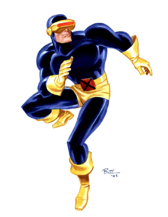
Bruce Timm has loads of Good Girl art online but his heroes are pretty cool too, and obviously I'm gonna like this one....
One of my favourite Invisibles covers, this is the uncoloured version by Brian Bolland...I love the open, unrendered art here, reminds me of the ligne claire or animation-inspired art styles...
Always love Dave Stevens' art and this cropping from one of his Rocketeer pages features probably his most striking depiction of Bettie Page...
I quite like looking at model sheets, especially ones that feature pre-existing characters as it shows how much you can change a character's look while remaining true to the concept. This is Arisia from the original Green Lantern animated DVDs...

Sunday, 4 September 2011

Frustration


Well, BICS was last weekend, quieter than normal but still fun. After nearly 2 hours, gave up waiting for Chris Sprouse as he only did four sketches in that time and I was feeling nauseous standing on the spot for so long. I trundled about and picked up a few bits but the real bargain was the Wolverhampton branch of FP, who were having a sale on the Sunday. As well as picking up two Euro albums and Bigg Timme for £4 each, I also picked up Skizz for the same price.

I've always wanted to try this but the art has always put me off but for £4, I gambled and picked up a winner. Alan Moore and Jim Baikie (who's art I soon warmed to here) crafted a solid "ET meets Boys From The Black Stuff in Birmingham" story that rolls along at a great pace. Unable to add as much complexity as his later work due to the four-page instalments, Moore still turns in an emotional level that helps make this book sing. If you've never read it, give it a go (and I rate it much higher than Halo Jones).

Wish I could say the same with my art...I've been pushed for time for the past two weeks and everything I try to do just comes out shit...I'll have to slow down and not try to rush through stuff so much, as the above work shows...

Thursday, 25 August 2011

Light (box) Entertainment


I search the web a lot for artists I like, and invariably end up cribbing a lot of pieces I like and as with the net in general, I often stumble across interesting further work. Some of this inspires me in curious ways...

For instance, I saved a Kid Flash model sheet from the Young Justice show and one of the few things I like about the DCNu is the Kid Flash design (though I still prefer the original). I wanted to devote time to drawing the new costume when I decided to do a comparison instead: lightboxing the model sheet, I quickly finished all three versions...unsigned of course, as I don't feel this is my work at all...

However, I'd always fancied a crack at inking Jack Kirby's stuff. It's so bonkers and abstract, I always thought it would be an interesting challenge as I know I'd inevitably try to beat it into a more realistic shape. So, inspired by the Kid Flash messing about, I downloaded two Kirby pieces. I've got a Superman piece to ink, which I'll ink in my style (i.e, it'll look nothing like Kirby probably!) but thought I'd test the waters trying to be true to Kirby on another piece first. I picked an Orion pic and while it seems quite faithful, I still caved slightly and made a few corrections:

1. The helmet wasn't quite symmetrical at the top so I curved it off a bit and redrew the left (as we look at it) wing, which didn't match the other one at all. In fact, for all Kirby's weird geometric costume designs, his drawing was far from symmetrical! I also gave the helmet "my2 metallic sheen as opposed to Kirby's , raising the trim at the edges.

2. Kirby always drew weird thumbs and fingers so I corrected them before trying to impose some kind of implied musculature on the upper arm, while tidying up the lower arm and filling out the elbow a bit.

3. I extended the glimpse of the far pectoral muscle and added a spine between the shoulder blades, which I tried to define a bit. I misinterpreted the art and mistakenly omitted the shoulder ring but tried to suggest an oblique muscle and texturised the belt.

4. I tidied up the upper leg muscles slightly, reworked the knee areas and redrew the foot so that it no longer resembled a frogman's flipper, also adding a trip to the boot design. There seemed to be a consistent flow of clothing creses from the groin to the the rear arm, so I kept that in the trunks but tried to imply some anatomy trhough them. I did some major streamling on the knee/upper parts of the receding leg but left the lower parts mostly untouched.

I'll add the original version as a comparison, along with another Orion that just made me laugh..

Finally, although I've used them before, I wanted to play around with the (non-Copic) markers I picked up recently. While they work like Copics, the gradations between them aren't as smooth as the Copic range so I think I'd choose to return to them for something serious. Here are an few headshots of Erica Durance shaded with the markers: not great likenesses but I'm warming up to the effects now so will probably colour these at some point.

First though, I have a Kirby piece to return to...
PS Just added a side by side comparison above...

Thursday, 18 August 2011

Bitz n Bobz


Currently, I am nearing the end of a week-long stint house sitting and looking after a dog, cat, fish, guinea pigs and lizard. Armed with a stack of reading (thus cutting down my backlog of reading to one book, two Williamson collections and a Frazetta collection), I found that typing on a laptop is a bloody frustrating exercise and abandoned my plans to continue revising my comic-0n-TV book for the second printing. So what else has been going on recently?

Two things are out now featuring my work: details of the tsunami relief project Spirit of Hope can be found at http://www.comicbook.org.uk/spirit-of-hope/ , while Dirty Bristow#2 is out now, a Birmingham based magazine featuring a few of my illos for a piece by Mr Tom Lennon, also available online: http://dirtybristow.co.uk/pledge/

Nice feedback here too:

Danny found his interview with an Otherkin was relatively easy to write but tracking someone down willing to talk to him was in his own words ‘the ballache of the year’. His pick is Tom Lennon’s Mythical beasts of Birmingham.

“It’d be a cliche to say how difficult it was to pick my highlights because they’re all so good wouldn’t it? I’ll just say that Tom’s piece is top quality funny and writing from a fresh local talent given room to write something that probably wouldn’t fit elsewhere. With frankly jaw dropping illustrations from Nigel Lowery, it’s why we started the magazine in the first place”

I've also been contributing more often to theweeklythemedartblog recently. I missed a few for being spoiled for choice but the one about robots coincided with watching an DVD tutorial by Adam Hughes, so I was inspired to create the piece above, Platinum of the Metal Men. I've also attached my version of Forbidden Planet (not likeness-strong as I wanted to change the horrid 50s hairdo) for the same blog...

Also put up a jam between me and Tony McGee: he inked my Loki, I inked his Magneto then he sank my battleship...

Fancied a chance on the Space Ghost DVD, as I only ever saw about three episodes as a kid, shuffled around the ITV schedules as space fillers. I LURRRVED them...but oh, dear, they've not held up well. Still, an excellent feature length documentary on Alex Toth makes it all worthwhile: odd to see quotes I've just read in Genius isolated spoken aloud on the DVD!

Ahead of the Avengers (shot of above) next year is Ghost Rider 2...it's almost certain that it can't be worse than the original (though the Rider himself, his bike and Carter Slade were all well executed) but it actually looks pretty decent. It feels more like the mood of the comic and the last few minutes alone are worth watching the trailer for:

Thursday, 11 August 2011

My Review of Adam Hughes DVDs

Originally submitted at Jerry's Artarama Art Supplies

"How to Draw Good Girls" - 80 minutes Follow Adam through his artistic process, from a clean, blank sheet of paper to a completed pin-up illustration. Adam will demonstrate how he draws, inks and tonally renders in marker a "Good Girl" illustration right before your eyes! Adam H...


AH! Shouls Say So

By Nige Lowrey from High Wycombe, Bucks on 8/11/2011


4out of 5

Pros: Easy To Understand, Good Resource, Informative, Entertaining

Best Uses: Occasional Refresher

Describe Yourself: Intermediate

As a fan of Adam Hughes and a beginning to dabble with markers artist, this DVD was a must have for me. First the bad points; this isn't exactly a bad point but this DVD isn't really an instructional on how to draw (although Adam is seen sketching and fleshing out the drawing), it's a tutorial for how to use markers. many artists are starting to use marker techniques so it's great to watch one of the best practicioners at work. Starting from scratch, Adam builds the work up in layers, clearly explaining the techniques, his processes and the choices he makes as he goes along. While providing an insight into the artistic process, this is best viewed as an essential tutorial in effective use of markers. Production value is simple but clear, while the contents are quite inspiring. Well recommended.

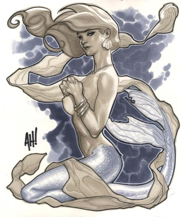
The mermaid Adam creates during the DVD

thumbnail

(legalese)