Wednesday, 29 June 2011

JLIconic


While I have no interest at all in the new ongoing Justice League International series, I'm eagerly awaiting the upcoming DC Retroactive JLI 90s issue reuniting Giffen, DeMatteis and Maguire on the team again (the one-shot also features a classic reprint, please be #23, please be #23!). Looking closely, it's another variation on the classic Justice League #1 cover, surely one of the most aped and emulated covers alongside fare such as Amazing Fantasy #15, Action #1 and Uncanny X-Men #1.

For no real reason, thought it might be fun to bung up a few variations of that classic cover...

Sunday, 26 June 2011

These Three Days Point


Coloured the Flash (that became the Reverse-Flash, Professor Zoom) and thought I'd stick 'em together in a race, first prize being a new continuity apparently :)...

Monday, 20 June 2011

These Three Days


Well, a busy few days...

Saturday saw me attending Launchpad in Birmingham, a one-day seminar for aspiring comic creators. While I wouldn't rule out working for comics publishers, I feel telling my own stories may be the way to go as it allows far greater freedom. It's still insightful getting portfolio reviews so I showed mine to DC editor Joey Cavalieri (possibly the vaguest review I've ever had) and John McCrea (who's comments were much more helpful). Joey's comments did reflect comments made in a lecture by Klaus Janson...

...now anybody who knows me knows I'm far from a Janson fan as aesthetically his work is too rough and (deliberately) messy for my liking, but I respect his ability and his knowledge: i still have his book on pencilling (though yes, I did pass on his inking book). His talk was confident and full of little nuggets: both confirming things I already knew but also reminding me of things I'd forgotten and introducing a few new ideas. I learned a lot from his talk and for that alone, launchpad was worthwhile. However, I also went to see an inking demonstration by him that I ducked out of to attend what turned out to be a hilarious talk by John McCrea that topped off an informative day...

I also picked up a few art supplies, a brush pen (more chunky than the one I own) and a set of grey tone markers (not Copics unfortunately but I've been assured they last longer despite being non-refillable). I'm a huge brushophobe but after experimenting with a Dr Strange pic recently, I was eager to push the same colouring techniques. With the new brush asking to be tried, I thought I'd give it a shot at the same time and pencilled a piece that I intended to brush-ink and computer colour.

I chose Professor Zoom (mainly so I could also place it on The Weekly Art Board) but drew it as the Flash: I may want to do a Flash/Zoom version so by drawing it as the Flash, I only had to reverse the art and black in the emblem (which is why I didn't draw it as Zoom then flip it as the Flash). Far from the greatest drawing and the inking is very uneven...but surprisingly I managed to ink the whole character with the brush. It's not bad and I like the boldness the brush line gets but think I'll stay with pens for comic art but will definitely use the brush in future for other things.

Originally i was going to draw Green Lantern after having seen the movie this weekend: thankfully, it wasn't the disaster I had hoped for as it had a lot going for it. Extremely faithful to the comics, I can't see why people are complaining about the info dump opening the film: almost every sci-fi and fantasy film from the 80s opened with a voice over or opening text, something that never hurt Star Wars. Anyway, Reynolds was good as Hal and most of the rest of the cast is great, especially Sinestro. Blake Lively isn't film-destroyingly terrible as Carol Ferris but is an emotionless plank (thankfully she has a nice wardrobe so you at least have something to look at while she's babbling).

Like X-Men: First Class, the film zips along fairly well as it doesn't get mired down in A and B plots but there are some large structural problems. They are not exactly plot holes but occasionally a character appears with little reason or explanation as to why they're there: Amanda Waller's appearance is pointless as her presence is never really explored so only if you know her from the comics will you suspect a government connection, for instance. There seems to be a few scenes dropped or lines cut somewhere.

Green Lantern's another Big mac of movies: could have been a lot better, could have been a lot worse but it's perfectly fine while you're experiencing it but afterwards you wish you'd chosen something a bit more substantial...although that green pickle is really good...

Sunday, 5 June 2011

Quick Post


Just a quickie, the coloured versions of the Avengers and Flash Gordon pics posted a couple of posts ago...was going to take time to do some decent colouring on the Flash piece but it's fairly busy so I went with flat colours instead, although I may do some tinkering if I get the time...

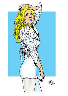
The Sue Storm was the second of two pieces done on holiday: I bought a paper and drew two pics from inside at A5 just for fun. This was originally Fergie from the Black eyed peas and I adapted it into FF style Sue Storm, though I only REALLY kept the mostly-white colour scheme...

Friday, 3 June 2011

DCNu or DCPu?

I don't have a problem with DC's upcoming line-wide relaunch: in fact, post Crisis On Infinite Earth s and Zero Hour results aside, I think it's a pretty cool idea, a chance to revitalise the line by trimming dead titles, spinning out new ones and tweaking successful current ones. It's good to breathe in new air from time to time.

Well, the early signs are that the new air is somewhat flatulent.

I have no problems with the creative directions and tweaks, although the fact that this is yet ANOTHER continuity reboot for the DC line just a few years after Infinite Crisis (which saw a 12-issue DCU Legacies series follow that explained the history of the new timeline, which has now been wiped out again...god knows how the Legion will be affected now!) kind of rankles a bit. What bugs me is the creative choices for some of these relaunches.

Geoff Johns and Jim Lee sounded like a great time on Justice League...until I saw the art. The Flash had a simple, graceful, effective costume design...which has now been slapped with unnecessary tinkering. This detracts from the look of the character but doesn't add anything either: the results look like a toddler has scribbled over things and as the changes are minor...what was the point?

Aquaman looks OK, Wonder Woman I can deal with and Green Lantern has unnecessary fiddling added but what the hell's going on with Cyborg? He's always been fairly streamlined and had a nice Mike McKone redesign a few years ago...but now he looks like an awful 90s Rob Liefeld reject. How can you relate to Vic Stone when he looks so clunky.

I can deal with the tweaking of Superman's emblem: it's not really changed quality wise, just different but pointlessly amended as it has no real impact doing so. I like the loss of the red pants...but why has he got lines across his forearms? Another pointless fannying around that adds nothing. Hawkman's helmet is an ugly clunker and while both new Firestorm designs have interesting elements, neither holds together as well as the original Ronnie and Jason designs. They bring back the JLI: then give Booster a new costume that's only out-uglied by his 90s armour.

The execution of this has not only dropped the ball, it has let it roll off the courtyard and into the road. I'm hoping a crushing meeting with an oncoming vehicle isn't far away. These needlessly ugly tweaks have really disillusioned me from Dc and makes me remember why I have less and less interest in Marvel and DC's creatively bankrupt output despite desperately wanting to find something from them to enjoy.

I'm currently reading an IDW trade that is so much more satisfying than Marvel or DC's output and reminds me why I'd rather work for myself than on corporate characters at the moment...