Tuesday, 25 November 2008

Rainbow Green


Well, it was only ever going to be one of two characters for green, wasn't it? (Although I ran across an obscure Golden Age hero called the Green Turtle that I was tempted to do as a laugh!). So here's Hal Jordan, the best Green Lantern---I may do silver, purple, scarlet or crimson as the final post as I think all the colours are as represented as they're gonna get.


I started these as an exercise in anatomy but haven't really learned anything as I'm pretty much drawing a pose and using ref to tighten details. I'm hoping to crack open my mini-pad and start some proper practice and learning now...

Sunday, 23 November 2008

Rainbow Grey


Well, for the latest instalment of the rainbow thread I've done Jean Grey. OK, that might be a bit of a cheat but c'mon--who really wants to see the Grey Gargoyle? Sheesh! This isn't perfect but isn't too bad...I had originally intended to do a nice flamebird effect but time got away with me again (what with catching up on sleep, washing and ironing, etc) so I had to let it go.

Rolf Harris Night on BBC3 tonight so I'll watch most of that, though I'll flip over to watch Survivors...I don't recall the original but the premise is interesting so I'll give it a try. I've been watching DC Super Heroes on DVD recently, something of a strange collection.
Containing 18 6-minute episodes originally run as backup segments of the Superman/Aquaman Hour (if I recall my research on my still lingering book on comic movies and TV correctly), this DVD features 3 outings each for the Atom, Flash, Green Lantern and Hawkman, who also join with Superman in 3 Justice League episodes: the original Teen Titans round out the disc. These were produced by Filmation, who produced such childhood cartoon favourites as Flash Gordon and Tarzan and are apparently notorious for reused footage. This is quickly evident in the animation itself but also the plots, which usually find the heroes fighting off alien invaders. Though primitive by today's standards, and burdened with a stereotypical superhero narration, the shows are not without charm but get hard going if viewed together.

The designs are fairly faithful with two notable exceptions. The Atom and Kid Flash have two of comics' greatest designs but the cartoons do away with the Atom's red pointed torso design and extend his blue mask and chest area down to his shorts, a pointless change that detracts from the visuals. While the Flash is given yellow gloves and a standard yellow belt, he is not as altered as his sidekick (who keeps calling his mentor "Flasher"!). Kid Flash basically has his colours reversed and is also given a pair of shorts: the only reason I can think they made this change was to make him look more like the Flash, except he looks almost identical to Johnny Quick instead.

While a friend laughed at a Frazetta DVD special feature showing Frazetta draw with his left hand (sounds amusing till you find out he had a stroke which means he can't use his right hand to draw so he learned to use his left hand instead--and he's still good!), this contains the most pointless DVD extra EVER: the end credits of the otherwise unrepresented Aquaman cartoon! It wouldn't be so bad if the sequence was interesting, but it's just a still shot of the domed city of Atlantis! WTF? Another thing that puzzles the hell out of me is the inclusion of Birdman on the DVD menu. Now I don't recall this character at all (currently revived as Harvey Birdman, Attorney on Cartoon Network), but not only does he not appear on the disc whatsoever, he was a Hanna-Barbera character and has no ties to Filmation's DC adaptations whatsoever.


These goofy facts are more interesting than the episodes and the DVD has convinced me not to try the Space Ghost DVD as I can't face anymore shoddy old animation---though Space Ghost could be gold in comparison...

Saturday, 22 November 2008

Mr Pjangless


I had a bookcase delivered today and hoped to get it built pretty quick and crack on with some practice drawing---there's a headshot I want to do and I went to the Works yesterday to pick up a cheap little A5 pad for some practice sketching (which I've not done for years). Needless to say, things didn't go to plan and I got waylaid again.


Building the unit was fine--a 2 person assembly job swiftly put together just by myself with great results. Trouble is, the idea was to get the bookcase to free up some storage space for my trades and whatnot. Inevitably, this led to me routing through my collection again, weeding out a few things and transferring stuff from box to box to shelf. Outside of a handful of favourite runs, most of my collection is filed in artist order and as most of it's boxed up, I don't know where most of it is but at least I was able to drag out my longbox of Adam Hughes stuff (and I have virtually every issue he'd provided art for from his earliest indie work up until Rose & Thorn, when I couldn't justify continuing to buy stuff for his glorious covers to find absolute crap inside--specifically Frankenstein Mobster, one of the worst comics I've ever been suckered into shelling out cash for).

Incidentally, was around my sister's last night and caught a bit of I'm A So-Called celebrity and rifling through my back issues today, I was struck how muck Alex Ross' Supreme looks like Robert Kilroy Silk...


...course, that show also features George Takei of Star Trek, and have to say, I'm quite impressed by the new Star Trek trailer. I'm still not sure if I can get past Shatner and Nimoy not in the lead roles, but it looks like a decent flick in its own right.


Talking of young faces from the future, check out the pic above of the Legion of Superheroes from Smallville. They were never going to be in full uniform but I like the incorporation of Lightning Lad and Cosmic Boy's emblems on the jackets...looking forward to this (think the episode is also written by Geoff Johns, so they should remain in character!).


Seeing as I've not done anything artistic--not even colouring the next colour character--today, I've put up my cover for Pjang #2 (check the link at the left to Rol's site for more info). I wasn't going to post it until it was printed as unveiling it was Rol's prerogative but he's already unveiled the lettered version (and some back stage discussions!), so it's no spoiler now. I was considering a second version that would try to closely emulate Adam Hughes' style but Rol said he liked the first version while I was still pencilling the second version. I was already going wrong so I gave up but would still like to do a Hughesish piece sometime.


Maybe tomorrow I'll get around to pencil pushing again...

Wednesday, 19 November 2008

Rainbow Yellow


Y'know, this colour thing's not as fun as I first thought as although there are tons of black and red characters, the choices thin out as you move through the colour range. The next pic's already scanned in but I'm really not looking forward to considering an Orange Lantern!


Anyway, here is a pic of Yellowjacket---I've done two pics of him before so thought I'd vary things by streamlining his costume a bit (the yellow stripes on his gloves and boots meant to be reminiscent of wasps). I didn't think till after that I'm not overly fond of the earlier pics so should have done the standard version anyway. Instead, we have something...different...

Sunday, 16 November 2008

One Elle Of A Disappointment


A few months ago, I had three characters I wanted to draw: Nico was OK but not as good as I hope, Rogue turned out quite nice and I was hoping Elle from Heroes would turn out nice. No such luck: one out of three's a pretty poor hit rate.

While the likeness is terrible (to the point of bearing NO resemblance!), I was fairly happy with the lineart version, the pencil shading was ok but it all went really wrong in the colouring stage. The lightning was the final topper that threw this into the crap pile...I'd drawn in the bolts and intended to wipe them out in photoshop. However, that proved to be really time-consuming and dull so I just went over the bolts with the airbrush tool. I'd already added a soft haze to the bolts but these were eaten up during this final process.

As I hate this pic, I've also attached the earlier stages, which are much more successful. I'll probably still try to get a decent likeness for Elle out of bloody-mindedness but time to leave this one behind...

Saturday, 15 November 2008

Askewed Perspective

Left work early yesterday to make it to the new local cinema to watch Zack and Miri Make A Porno, surprisingly only the second Kevin Smith film (after Dogma) I've been able to catch at the cinema. (The ticket was also thankfully alot less than the £8 I had to shell out the last time I went to this cinema!).

So, any good? Well, Smith has matured as a visual storyteller as this looks the best of all his movies and has some interesting shots and camera moves. Seth Rogen is amiable enough and Elizabeth Banks (Betty Brant in the Spidey films) is not exactly hard to look at but after a promising start, the film soon had me wondering and having watched the whole thing, I'll have to say my fears were confirmed and it's not much of a repeat viewer.

I loved the dialogue in Smith's previous films but here some of the characters spout some Smith characteristics: not so much what the characters say or talk about, but the phrases they use. That become disconcerting because the dialogue flowed in a familiar way but didn't have too many laughs to back it up. There are some funny bits and it ends up being quite a sweet film but overall, it just didn't have me chuckling as much as the Clerks instalments in particular, but any of the previous View Askew films in general (except for Jersey Girl, which was quite good for a chick flick). I hope the film does well but I fear I'll only pick up the DVD (as the features are bound to be great) cheap in the sales and then mostly out of complete ism for my collection of Smith films.

Funnily enough though, A Threevening With Kevin Smith turned up today on DVD, and I'm looking forward to that as I really enjoyed the previous ones. This one was filmed in Red Bank, as the DVD cover shows the theatre, which I passed on the way to the Secret Stash store. For those interested, it's near Carlos O'Connor's, the only Irish-Mexican restaurant I've ever seen!

Arriving with that DVD was DC Super Heroes, a DVD featuring all the supporting short cartoons from the 1960s Superman cartoon series produced by Filmation. It's always a bad thing to revisit childhood shows and these look decidedly ropey from clips I've seen on Youtube. However, watching early adventures of Green Lantern, Hawkman, Flash, the Atom, the Justice League and the original Teen Titans. Mainly picked up for the curiosity factor, this also serves two further purposes: seeing if I can stand this old animation may let me know if I can possibly contemplate the 60s Space Ghost DVD and also gives me something to watch in lieu of Family Guy.

I hardly watch any TV but used to enjoy BBC3's Family Guy double bills each night after I'd finished pottering about but it's been reduced to only a night or two each week. However, my TV viewing's suddenly shot up this week: always watch Heroes of course (which is a bit directionless but far better than last season and back on track now, despite sloughing viewers in the States) but Smallville's also back. I actually quite liked the first two episodes after the hacky seventh season. There feels like real character progression for the first time in ages. I find I don't miss Lex much as he'd been fairly marginalised over the past two seasons and while I'd prefer him back, Tess Mercer (get the ref?) is a decent character---undecided about Doomsday though. No Lana is also a bonus, as is more Lois. Joe Aherne's Apparitions (starring Martin Shaw as an exorcist) was surprisingly not bad so I'll keep tuning in for the moment and Clone on BBC3 will earn a look if I remember, although I have to say that I don't hold out much hope for this one. Still, Lead Balloon's also back and I love this show...loved the dialogue with Jack Dee's grumpy Rick Spleen character moaning to his wife about having their miserable Polish home help Magda staying with them for a few days...

"She used to live next to a power station, a little Calor gas isn't gonna hurt her..."
"It's carbon monoxide---it's potentially fatal..."
"...She could open a window..."


In addition, a ton of new reading material arrived this week: two new books from Cinebooks turned up today surprisingly quickly (and they have other interesting-looking books coming out over the next few months too) and my monthly parcel contained the new Azzarello/Bermejo Joker GN, the latest collections of Ex Machina and Empowered (a guilty pleasure, but I like Adam Warren's art) and Spidey: With Great Power. Lots of my time being eaten up again, I fear...

Rainbow Black


Well, to mirror the last post, here's the White Tiger's inspiration, the Black Panther. I was torn between drawing the panther or Black Bolt, both favourites as a child, but went with T'Challa as I pencilled a Black Bolt that just didn't work. Like Daredevil, the Panther's stuck with a fairly bland mono-coloured outfit but it works and he looks pretty cool. I always liked John Buscema's incarnation back in the late 60s Avengers issues.


Spent most of the rest of the day colouring another pic, which is nowhere near as good as I'd hoped. I think the black and white version is better but once I eradicate some black lines from the completed version tomorrow (cos I've had enough today!), I'll post it up here---maybe with another recent aborted drawing, the start of a second version of the cover to Pjang #2 (which I'll probably post after it's printed up).

Tuesday, 11 November 2008

Rainbow White


Don't gimme that "white isn't a colour as it isn't in the spectrum of light" excuse, it's not a smell, sound or monkey, is it?


In a pose similar to the discarded -and soon to be shredded- version, here's Hector Ayala, the White Tiger. This still isn't great but it's way better than the other version! I always liked the character, even if it's one of the simplest costumes ever. Still, there's no excusing those terrible ballet shoes (WTF were they thinking?!), so I've gone for a more traditional martial arts-style wrapping affair instead. Not sure which colour (or character) to pick next yet...


On a different topic---is anybody else wondering what the hell's going on with the public baying of blood for BBC staff lately? First there was the Ross/Brand affair, which snowballed to the point where more people complained about the show than actually heard it (and while I'm not defending their antics, phone pranks have been a radio and TV feature for ages, hence Fonejacker and those US radio characters, summat Boys), then there was an oversensitive retaliation against Clarkson's remarks on Top Gear. While I have no time for the merkin-headed gimpster, he's said worse and I fear there's a sense of blood in the air after the Rossbrand debacle. Now a regional reporter from Bristol has been sacked for unacceptable behaviour.


Her misdemeanour? Asking for a non-Asian taxi driver to drive her teenage daughter. Was this racist? Well, it 's assuming Asians are more likely to rape women than other races so it's bigoted at the least but the reporter also apologised for asking for a non-Asia but also asked for a female driver as well, as simply put she was worried about her daughter's safety. Now, again it's implying any male taxi driver will jump on her daughter like Gary Glitter on a copy of Mother and Baby so it's a little extreme--but surely it's understandable for a mother to be concerned about her daughter? These comments were made in a private capacity and were not explicitly racist (no derogatory terms were used) so while I won't defend her opinions, I think sacking her for them is a bit extreme. I suspect things will only snowball from here...

Monday, 10 November 2008

Rainbow Red


Next up in the Rainbow thread is the Red Guardian, a fun design I always liked as a kid. I've done the next colour but for some reason that and this Red Guardian piece are coming off not much better (or bigger) than the A-Z pics. This isn't TOO bad but the next colour's definitely not getting posted, I need to spend a bit longer than the 10-20 minutes the first two took.


I'm more happy with the other pic I'm working on. It's a lot worse than I envisioned--the face is OK but is a poor likeness and the pose is fairly uninspired. However, it dawned on me that the the original pose I had in mind was pretty similar to an Adam Hughes Wonder Woman cover. I could have still kept the pose exciting but chose to go for a fairly straight on "iconic" shot instead. I drew this at A3, reduced it to A4 and am now pencil shading it before scanning it in for colouring---even though it's not great, I'm taking my time as so far it's not that terrible.


In other news, my reading pile is now reduced to one coffee table book and two Euro graphic novels. I found I really liked the first Immortal Iron Fist (which explored the Iron Fist mythos in a new way that opens up the premise much as James Robinson's Starman did) and am quite looking forward to the second one (must look for Vol 2 later this month). However the book that really impressed me recently was Locke and Key.


There's been a bit of a buzz around Joe Hill lately and I may have to check out his novel, Heart Shaped Box, which sounds pretty cool. I'd heard good things about his IDW comic series Locke and Key so decided to pick up the first collection. The art was a bit cartoony for my tastes but I'm always complaining I can never find anything new and interesting so decide to give it a chance anyway. The story essentially follows three siblings returning to their ancestral home after the death of their father. Once they return, the house slowly reveals mysterious secrets as a worldly threat follows them home.


Within a few pages, Hill showed a better grasp of storytelling than most other writers and his characterisation and pacing are impressively strong. The art soon grew on me as, though slightly cartoony, there's solid and crisp drawing that proves to be very engaging. What's better, this collection is formatted in a way that I haven't seen for ages in a collection but is one I always wanted to see return. There's one artist throughout and no dead filler pages to allow for double-page spreads or covers interrupting the story. Instead there's one continuous uninterrupted block of 6 issues' worth of story with only the chapter headings to give any indication of issue breaks. As these are incorporated, Heroes-like, into the underlying art and don't feature numerous credits, this makes the collection feel more like a book than a collection and feels so much better for it.


This is the most satisfying comic I've read for a while and a most recommended suggestion for anybody's read pile.

Saturday, 8 November 2008

Rainbow Blue


Well, here's the first in a new strand of posts following the A-Z vibe, characters with colours in their names! I intend to start toning up on my anatomy drawing a bit so decided to create a theme to make these practice drawings more interesting. First up is the Blue Falcon, who I have kept fairly rendering free as he's an animated character so the slicker look seems appropriate.


Eventually, he'll be joined by other colourful characters, though I think I'll give Cerise, Magenta and Agent Orange a miss. I know who I'm doing for red, beyond that I'm open to suggestions.


As well as the Blue Falcon pic, I drew the logo for Pjang #2 this morning and finished up assembling the cover and started two headshots of Kristen Bell in preparation for a drawing of Elle from Heroes. I abandoned the first pic fairly early as it was going all kinds of wrong but the second one is quite nice as a drawing but crap as a likeness. Hopefully third time will be the charm for this one. That may be some time off as I need to finish off the Magneto article and basically tidy up my PC a bit as it's starting to get a big clogged...

Tuesday, 4 November 2008

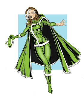
Rogue 'n' Josh --AMENDED


Well, things plans have changed a bit around here as a long anticipated holiday trip to Slovenia has just fallen through as my two pals had a serious falling out on Friday night. While I'm sad I won't be flying off and visiting Slovenia, where I'd hoped to hop over various international borders on quick daytrips, and further trips to New York now seem a distant pipe dream (I LOVED my two prior trips with these two mates), I'm most saddened by the breaking of their friendship with each other. Hopefully bridges can be rebuilt, but we'll have to see.
The one upside from this is that my pocket's a little less battered so I cheered myself up with ordering something I'd had my eye on for a while (hint, they're blue and gold!). The first stab at a cover for Rol's upcoming Pjang #2 seemed to be what he was after and I've just struck off the second of three characters I wanted to draw by colouring the above pic of Rogue. I drew it at A3 to practise larger figures and intended to add backgrounds but as with an earlier Power Girl pic, I ended up loving the uncluttered figure. I've been trying to follow Tony's excellent Photoshop colouring tips but I think I'm always going to have trouble with layers. I need to practise with colour burns and have yet to seriously attempt another of Tone's methods (his current technique works great but I think may be too complicated for me to ever get my head around), so this was coloured just using the simple multiply layer.
Next up will be the colouring of Pjang #2, then Elle from Heroes and the start of a new mini-thread...
Update: just added shading to the face and hand, quick five minute touch-up (ooer, missus!)