Well, things plans have changed a bit around here as a long anticipated holiday trip to Slovenia has just fallen through as my two pals had a serious falling out on Friday night. While I'm sad I won't be flying off and visiting Slovenia, where I'd hoped to hop over various international borders on quick daytrips, and further trips to New York now seem a distant pipe dream (I LOVED my two prior trips with these two mates), I'm most saddened by the breaking of their friendship with each other. Hopefully bridges can be rebuilt, but we'll have to see.
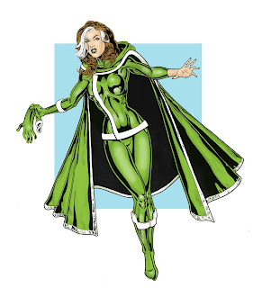
The one upside from this is that my pocket's a little less battered so I cheered myself up with ordering something I'd had my eye on for a while (hint, they're blue and gold!). The first stab at a cover for Rol's upcoming Pjang #2 seemed to be what he was after and I've just struck off the second of three characters I wanted to draw by colouring the above pic of Rogue. I drew it at A3 to practise larger figures and intended to add backgrounds but as with an earlier Power Girl pic, I ended up loving the uncluttered figure. I've been trying to follow Tony's excellent Photoshop colouring tips but I think I'm always going to have trouble with layers. I need to practise with colour burns and have yet to seriously attempt another of Tone's methods (his current technique works great but I think may be too complicated for me to ever get my head around), so this was coloured just using the simple multiply layer.
Next up will be the colouring of Pjang #2, then Elle from Heroes and the start of a new mini-thread...
Update: just added shading to the face and hand, quick five minute touch-up (ooer, missus!)
3 comments:
That's come out really nice, good choice of colour and nice shiny highlights. Coulda used some variation on the skin tone, but it's a great pic, and I'm warming to that outfit now (though the cape still seems redundant).
As for Tone's colouring tips, my method's variable depending on what suits the piece I'm working on. Been colouring straight from pencils this week so it's more trial and error than anything. Best just to find a technique that suits you, and you're definitely improving at the flat colours lark.
One of these days you'll have to remind me to update your gallery site ;-)
The reason I didn't vary the face tones was there was a slight mark on the face because I scanned a reduced photocopy and forgot to clean it up after I scanned it in. I kept the face flat so I could erase the mark easily after, though I suppose I could go in and shade now...
Still really liked the colouring on that print you're working on though...
Cool Rogue.
Post a Comment